Polish Squash Tour
Branding · Media
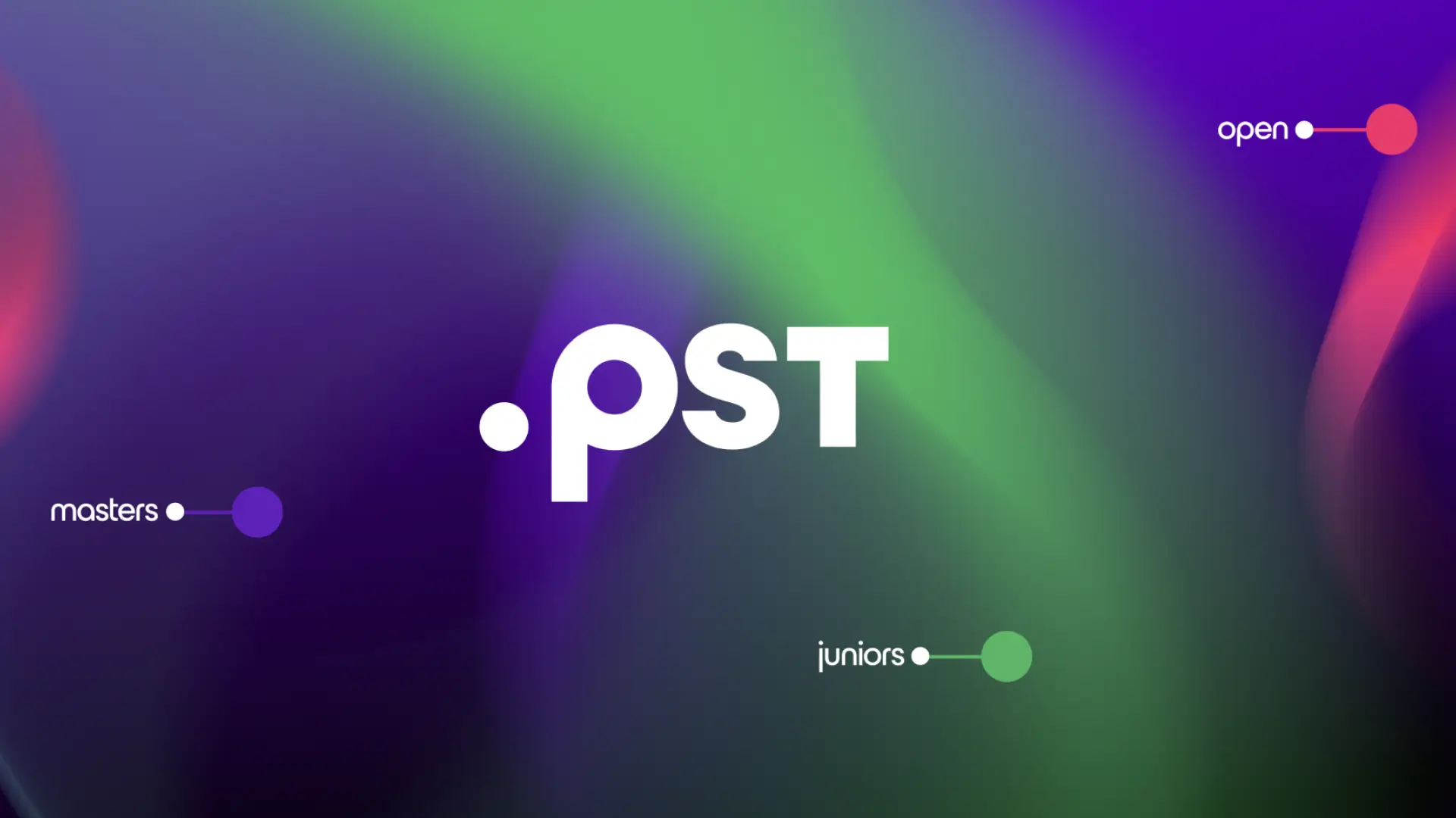
Branding umbrella – consistent and scalable identity for the entire tournament ecosystem.
Client
Polish Squash Federation
Industry
Sport
Range
Branding, digital, campaign
Result
Branding umbrella — a consistent and scalable identity for the entire tournament ecosystem
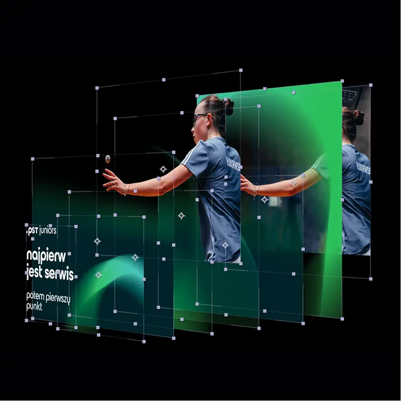




When designing an identity for the sports industry, the priority is to translate the character of the discipline into a visual language.
In the case of squash, this means capturing the dynamics of the game, the speed of body movement, and the trajectory of the ball's flight after being hit by the racket. It was these elements that became the starting point for creating the branding.
Challenges and goals
1
Treat as a new product
Building the Polish Squash Tour as a new product, rather than a simple continuation of the previous circuit.
2
Creating a branding umbrella
Simply changing the name or logo was not enough – the client needed a complete, cohesive visual identity that would serve as an umbrella for the entire tournament ecosystem: from youth to masters.
3
Translation into visual language
When designing an identity for the sports industry, the priority is to translate the nature of the discipline into a visual language.
4
Organizing the tournament structure
One of the key elements of the identity we built was the creation of a visual system that organizes the tournament structure in a clear and intuitive way.

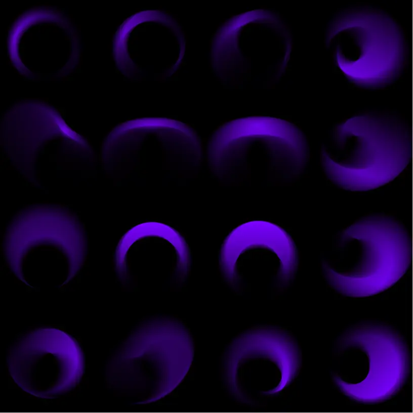
We applied an extensive system of blurry gradients that mimic the rhythm and intensity of the matches.
Result
8
SENIOR Events
4
JUNIOR Events
4
MASTERS events